Just to remind, here is the look of the current version of NetMonitor. There is no UI for managing the list of hosts, adding a new one or configuring the existing ones. The list of hosts are set in the application configuration file.
I keep thinking on NetMonitor’s user interface, especially on editing screens. Moreover, I’m trying to imagine good system tray icon, that won’t be annoying but informative. During my life as a computer user I tried thousands of software programs, lot’s of them had really crappy UI while only several were more or less usable.
For now I have selected the following patterns:
List management
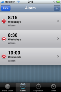
This is Alarms page from Clock application from iOS. The window shows a list of alarms, activation checkbox for each of them and 2 buttons on top that switch the screen: Edit mode and Add mode. No main menu, no toolbar are required. The UI is slick and simple to use.
The only question left is whether to keep those checkboxes on this screen or to move them to the host edit screen. As for alarms, the placement is right, so people could switch alarms on and off with ease, but what about hosts? How often users will enable and disable monitoring a host? The monitoring won’t wake you up early in the morning just because you forgot to switch it off. So, I tend to decide that the checkboxes should be put on the host configuration screen.
List edit mode
This window shows the same list of alarms but with different controls for each of them. Left red circle deletes an alarm, right arrow switches the window to the alarm configuration mode. Left top button is replaced with Done button that saves the result of list editing. However, the Delete control doesn’t deletes an item immediately, it displays sort of confirmation, like this:
Note that the Delete button appear instead of right arrow. This proves that Apple software developers and interface engineers took into account every little detail so a customer feel comfortable with the UI.
Item edit mode
The screen that provides configuration details for an alarm. Here you can’t switch it on or off, just set up the alarm time, repeat mode, alarm name and snooze mode. Top buttons are: Save & Cancel.
One more observation that might be interesting: if you noticed, the left top button from the main screen named Edit opens list management screen and the button Done there is located exactly on the same place as the button Edit. The same is true for alarm addition screen: button Add opens the Add alarm screen and the button Save is located right there, where button Add was. I think that this was done intentionally, after hundreds options and thorough UI testing.
Windows taskbar & system tray integration
NetMonitor is extremely lightweight, it is more like a tiny utility than a ordinary windows application, that’s why I suppose that it should sit in the system tray rather than in Windows taskbar. If so, then there is one utility which behavior I like -- network information popup window that shows currently available networks. It looks like this:
It is displayed after clicking on its tray icon and disappears after loosing the focus or after the second click on the icon. The elements I like here are: support of groups of items (collapsing and expanding groups, see up arrows), and network signal strength icon. The icon is displayed only for Wireless connections, so you might not be able to see it on your connected to a LAN computer. The only problem is that usage of similar icon is not a good idea, not only because the icon is the property of Microsoft, but mostly because users might get confused for 2 identical icons in their system trays. Another option to use a traffic light icon in the system tray, but I doubt whether this will be that informative.
Having described the future UI changes, I could proceed with the implementation. As soon as I have something to show, I’ll share the results.


 Hi there!