Wednesday, October 27, 2010

On WPF

Recently, I’ve get interested in practical usage of WPF technology and, as an obvious result, I’ve encountered plenty of obstacles as the technology is not as clear and straightforward as Windows Forms was.

I agree that from the theoretical point of view, WPF might be considered as a great step forward, but from practical one it is likely to be 2 steps backward. It is overcomplicated, it requires you to forget the well-known time-proven UI concepts and techniques, and to spend weeks and months on studying the brand new one. And even after that you can’t be sure that you are doing things right just because almost all things could be done in plenty of ways: code, styles, templates, etc. Not to mention the absence of several must-have controls in standard library, such as DataGrid, DateTimePicker, MaskEditBox, etc. on the moment of .NET 3.5 initial release. What are they hoping for? I don’t understand. Frankly speaking, it seems that WPF is bringing much more problems than it tries to solve. Remember blurry fonts and images, long application startup time, etc.

Moreover, I’m not alone in these thoughts. The Internet is full of stories on the subject. For example, when I was trying to find a solution for one of problems which could be easily solved in Windows Forms, I’ve bumped into an interesting and rather emotional post, which is titled as “What the HELL is wrong with WPF?”. Don’t miss it as well as its comments.

Some quotes:

- “Using WPF I can easily make a button which contains a spinning 3D cube playing videos on each face that turns green when the mouse goes over it, all without any C# code. Unfortunately, no one would ever want to do that, while it’s easy to imagine a situation wherein you’d want toolbar icons to gray themselves (like, I dunno, every Windows application ever made).”

- “I fucking hear ya! I’m also struggling with this shit every day just to discover that MS – again – really went out of their way to accommodate every possibility imaginable but rendering the whole system/concept unusable on the way.”

- “…I mean SERIOUSLY? What the fuck man! Win forms were a beauty, then why the flying fuck you want to release something ENTIRELY different and say that its the way forward especially when winform isnt broken. I mean why fix something when its not broken.
I am so sick of MICROSOFT and their policy of shoving their crappy pieces of junk software down our throats. They know people are smart and don’t want their shit, so they start issuing threats of disengaging old software unless you buy the new one.”

Wednesday, October 20, 2010

Scroll Lock key as OS crasher

Recently, while surfing the wikipedia website, I’ve bumped into an article about the ScrollLock keyboard key. In list of its utilizations in numerous programs, the following one made me smiling:

In Windows NT-based operating systems with a certain registry setting called "CrashOnCtrlScroll" enabled, double tapping Scroll Lock while holding the Ctrl key initiates a system crash to allow debugging the current state of the operating system.

Be careful, guys! =)

Wednesday, September 8, 2010

For those, who prefer the dark side

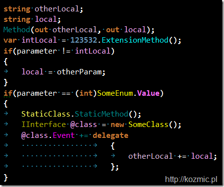
Just have found a nice color scheme for Visual Studio with ReSharper 5.1 {ColorIdentifiers = On} by Krzysztof Kozmic.

Here is how it looks:

R51

Hope you will like it.

Thursday, September 2, 2010

Are you a human being?

SO-fixed

Unfortunately, I’ve failed to pass the verification test. May be you will manage to do this?

Sunday, August 29, 2010

The most useless feature of Visual Studio 2010

Although the majority of people like discussing new exciting features and possibilities, I tend to be more rational and sceptical in this field. For example, I don’t like the new blue-yellow look of the studio,  I hate the new WPF-base editor because is doesn’t support my favorite open type fonts, I dislike the situation when every new release of VS is becoming slower and slower and eats more and more resources but the most annoying thing in my opinion is the tendency to add bells and whistles instead of concentrating on quality and performance.

Take, for example, the following “killer-feature”, which everybody might have already noticed:

VS-zoom

It is editor zoom control. Everyone was dreaming of this for ages. (Yes, it is sarcasm). They even dedicated to it a standalone post with video trailer. Nice. Here it is.

I especially liked one of the comments by Atle Iversen, let me quote it:

“Here are my suggestions for "features" in Visual Studio 2012 (which would make me actually consider upgrading)

  • increased performance (everywhere)
  • less bugs (everywhere)
  • less memory use/waste

I know that you put in a *lot* of effort in improving Visual Studio, but you're putting in the right effort at the *wrong* places - instead of more functionality with less quality we need less functionality with more quality !!!”

Although, I’m not sure that anybody from VS team has heard this cry from their customer.

Moral: Stop living in reality separated from your customers, their needs and requests. It’s a dead end.

Wednesday, August 25, 2010

Programming fonts

Recently, I’ve found an interesting post, where top 10 programming fonts are being compared. Every font is accompanied with comments and image of font in action. For example, one of my favorite ones, DejaVu Sans Mono looks like that:


Another one, which I also like and which is used in Android OS, is Droid Sans Mono:


The whole story is here. Hope you find there your new favorite programming font instead of boring Courier new and Consolas.

Sunday, August 22, 2010

Visual Studio 2010 vs. Inconsolata font

Hello,

After several days playing with the Silk style for Visual Studio 2008/2010 I’ve realized that you can’t achieve more or less good overall results with default fonts like Consolas, Courier New or something. I know that there is a perfect font, named Inconsolata, and what is more important, its author made it free. Here is how it looks like:

The same font in action:

I must make a remark that the font is being redistributed in OpenType format. I was happy using the font in Visual Studio 2008 but unfortunately, 2010 version has different Text Editor component, written totally on WPF and these things together make impossible usage of all other fonts except TrueType ones. WTF???

Luckily, I’ve found a workaround:

  1. Download the font from the official site.
  2. Go to online font converter, and convert OpenType Inconsolata font into TrueType format.
  3. Install TrueType version onto your system.
  4. VoilĂ !

VS

Hope that will be useful.

UPDATE:

Here is the second chapter of this fascinating story.